All photos courtesy of the Tampa Bay Buccaneers.
By Kevin Stone/@kstone06/@newftbj
Is everyone ok?
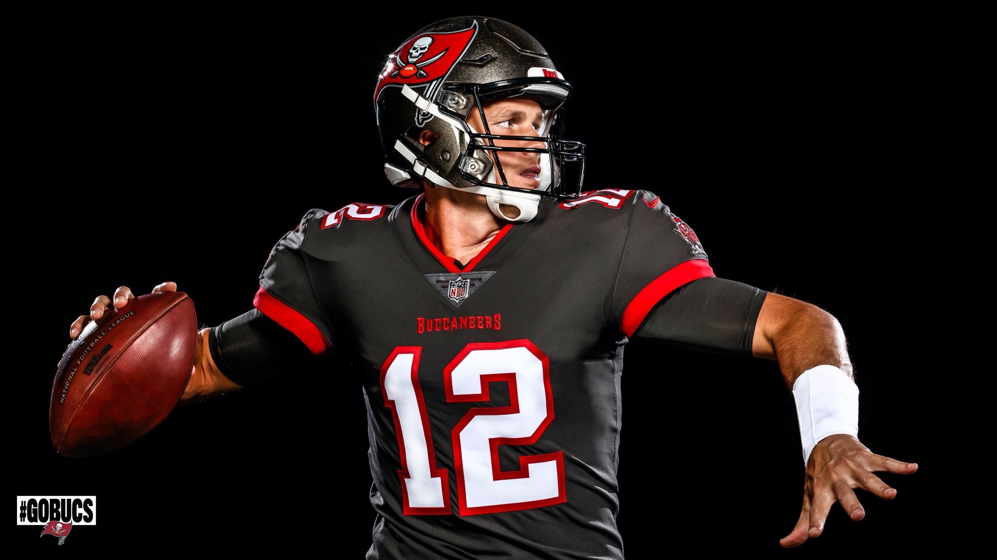
The Tampa Bay Buccaneers and Tom Brady unveiled “official” photos of him in the uniform for the first time on Tuesday, and social media quickly buzzed.
I am in the minority here and think he actually looks kind of normal – in a time where there is none – or at least it doesn’t seem as startling to me as I thought it would. People obviously feel very differently and I can understand why. I’m guessing all of the photoshops leading up to this day may have had a big role in diminishing that initial shock factor for me personally.
For starters, I think the pewter (light black? really dark gray?) alternate jersey is a phenomenal one. TB12 wearing all pewter with red trim on the sleeves and the white numbers outlined in red is a sharp look whether you now despise him for leaving or blame the coach for his departure. At first glance it’s hard to deny the uniqueness of the uniform and pewter pants accompany it to seal the deal as the best one of the bunch by far.
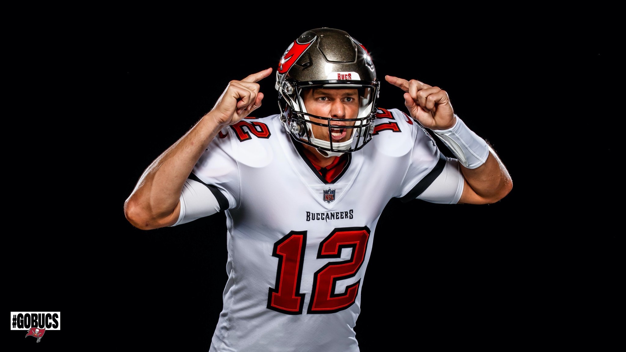
The white ones are also pretty good in my opinion too. All white with the red numbers outlined in black with white pants is a good look, it’s pretty hard to mess up a white-on-white uniform combination though. Black and red stripes down the pants are a good look too, they’ll definitely pop a bit on TV in places like Atlanta and New Orleans with that dome lighting.
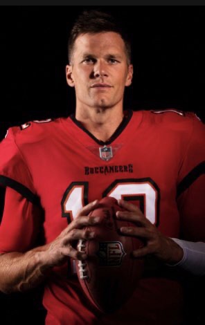
The one that does the least for me is the traditional home uniform Brady will be wearing. The standard red jersey with white numbers and black outline to go with the pewter pants is decent but not nearly as nice as the pewter or white ones.
I don’t want to play fashion police here at NEFJ, but it is quite strange to compare and contrast the look of Brady in a Patriot uniform for so long to the one we saw on Tuesday. Not only do I think he looks “normal” in the Bucs jersey, I can also envision him raising a trophy in one, and that’s usually the jersey test for me.
We could all picture Brady throwing to Gronk in a different jersey – as painful as it may be – but if you look long enough and think hard enough, I feel like he belongs in that jersey. It’s not the old light orange creamsicle color that represented failure for so long in Tampa, two of the three versions they put out are sharp, vibrant looks that fit the image of a guy who’s trying to rejuvenate his career (when he doesn’t even need to), pump his brand and show he was the man here in New England and not Bill.
Since there’s always a few people on Twitter ready to jump down your throat with any minor overstatement, let me clearly say that Tom Brady is not going to go on a revenge tour and win a Super Bowl simply because of his new uniform. However, if you’ve ever played a competitive sport of any kind, throwing on the uniform before game time gives you that feeling of pride and a sense of not wanting to let others down that are putting on the same threads.
Tampa Bay has made sure that when Tom Brady throws one of these jerseys over his shoulder pads this year, he’s not going to look down and see a symbol of mediocrity that will ultimately lead to him withering away and retiring. Instead, it’s a uniform that reeks of a franchise just waiting to take that next step for the first time since 2002, they just need the GOAT to get them there.